Strategic warehouse in Dongguan
OneStop Warehouse · Brand Identity
OneStop
Warehouse
A logistics identity built around movement, connection and one clear destination. OneStop Warehouse is a China-based logistics company with operations in Dongguan, serving businesses across sourcing, warehousing, freight, fulfilment and wider supply-chain operations. The identity was designed around one simple idea: One Partner. Every Solution.
01
The brief
One identity for a much wider logistics operation.
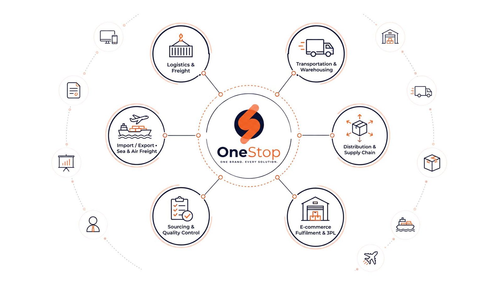
OneStop operates across transportation, warehousing, sourcing, fulfilment, import/export and broader supply-chain support. The identity needed to communicate movement without a generic truck, airplane or container—and remain recognizable across digital communication, stationery, outdoor advertising, vehicles, freight applications and architectural signage.
Operational logistics base
Primary international markets stated by OneStop
Sourcing, warehousing, branding, shipping and fulfilment
02 · The challenge
The Challenge
A logistics business like OneStop Warehouse communicates across very different parts of a customer journey. A prospect may first encounter the brand online, then see it through documents, sales material, freight operations, warehousing, shipping or fulfilment services.
The brand therefore needed one visual system that communicated movement, reliability and coordination without making its services look like separate businesses—and remained clear at small digital sizes and large physical scales.
- Logistics and freight
- Transportation and warehousing
- Distribution and supply chain
- E-commerce fulfilment and 3PL services
- Sourcing and quality control
- Import / export, sea freight and air freight
03 · The strategic idea
One Partner. Every Solution.
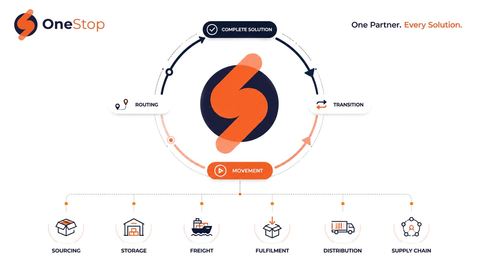
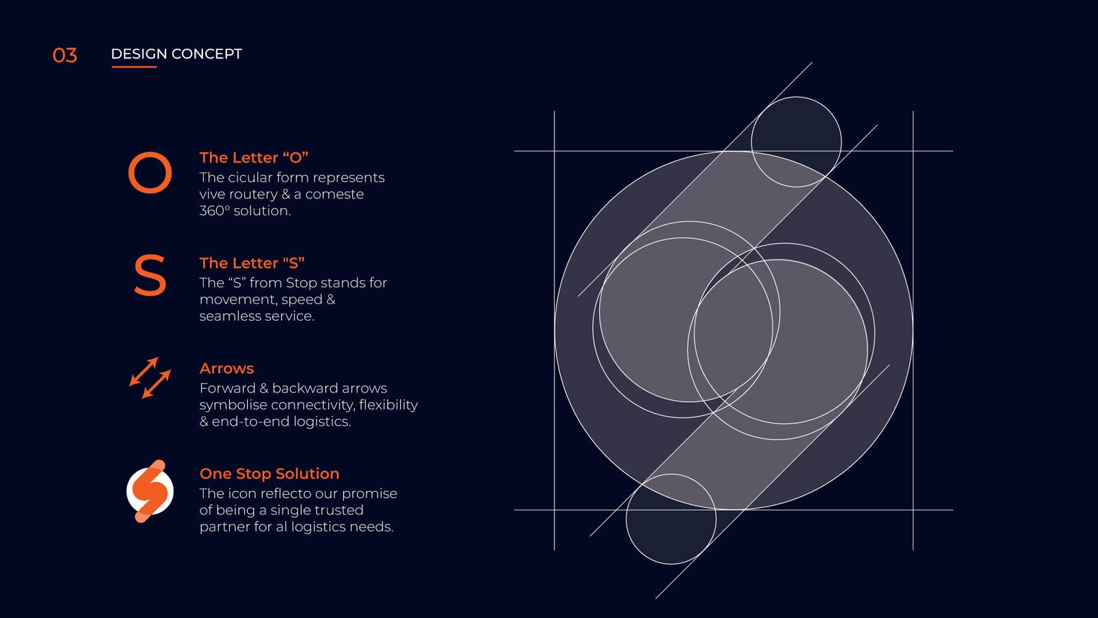
The identity was built around OneStop Warehouse’s role as a central point within a much larger logistics journey. Instead of representing one transport method, the symbol represents the connection between services.
The circular foundation suggests completeness and a full-cycle solution. The directional internal form creates an abstract S while suggesting movement, routing and transition. This lets the identity represent sourcing, storage, freight, fulfilment and wider supply-chain operations without tying the company to one individual service.
04 · Logo & identity
A flexible identity built for movement.
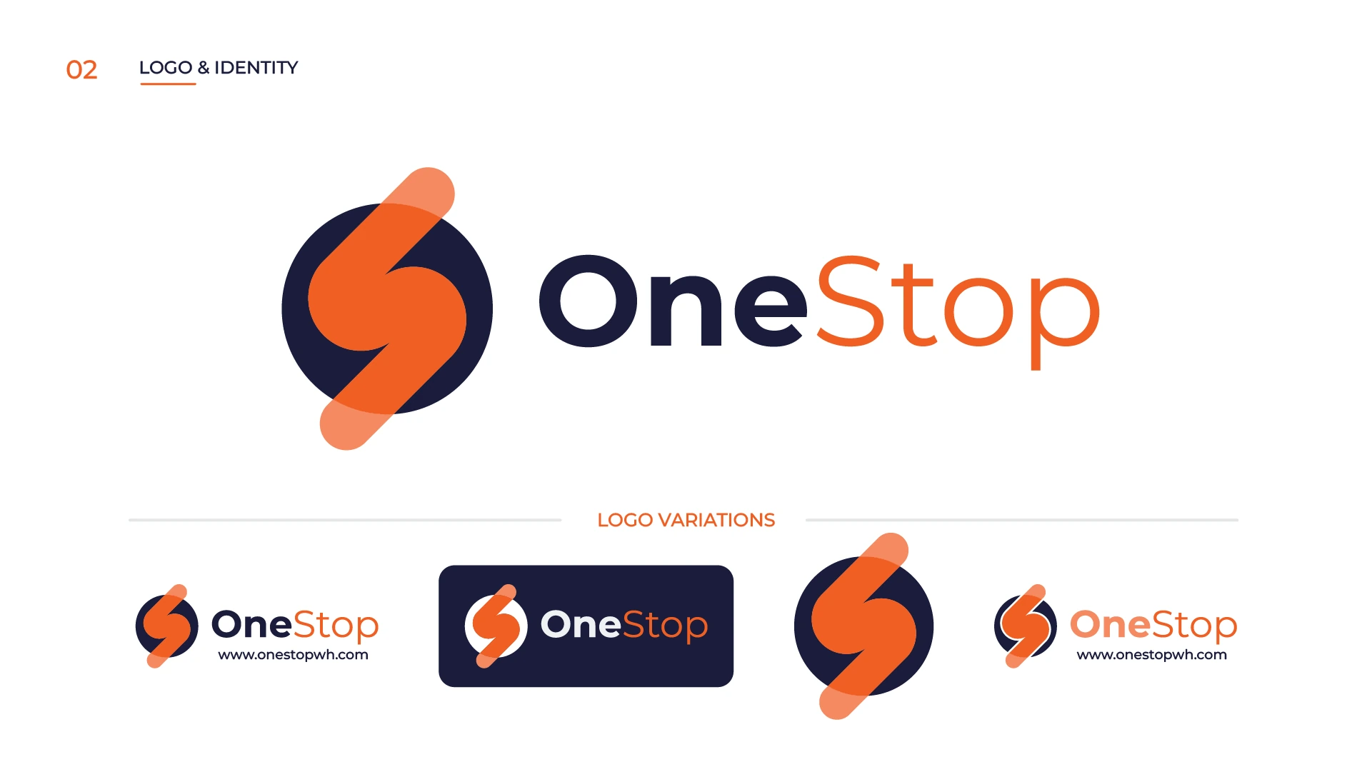
The primary identity combines the abstract symbol with the OneStop Warehouse wordmark. “One” carries greater visual weight and provides stability, while “Stop” uses Flame Orange to introduce movement and emphasize the central OneStop idea.
The identity was developed for light and dark backgrounds, horizontal and compact placements, symbol-only applications, physical signage and digital use. The objective was consistency rather than forcing one lockup into every environment.
05 · Design concept
Movement without relying on a transport icon.
The core mark combines a circular structure representing completeness with an abstract S-form, directional movement, transition and a connected 360-degree solution.
This makes the identity relevant to logistics as a system rather than one specific mode of transport.
06 · Colour system
A compact palette built for recognition.
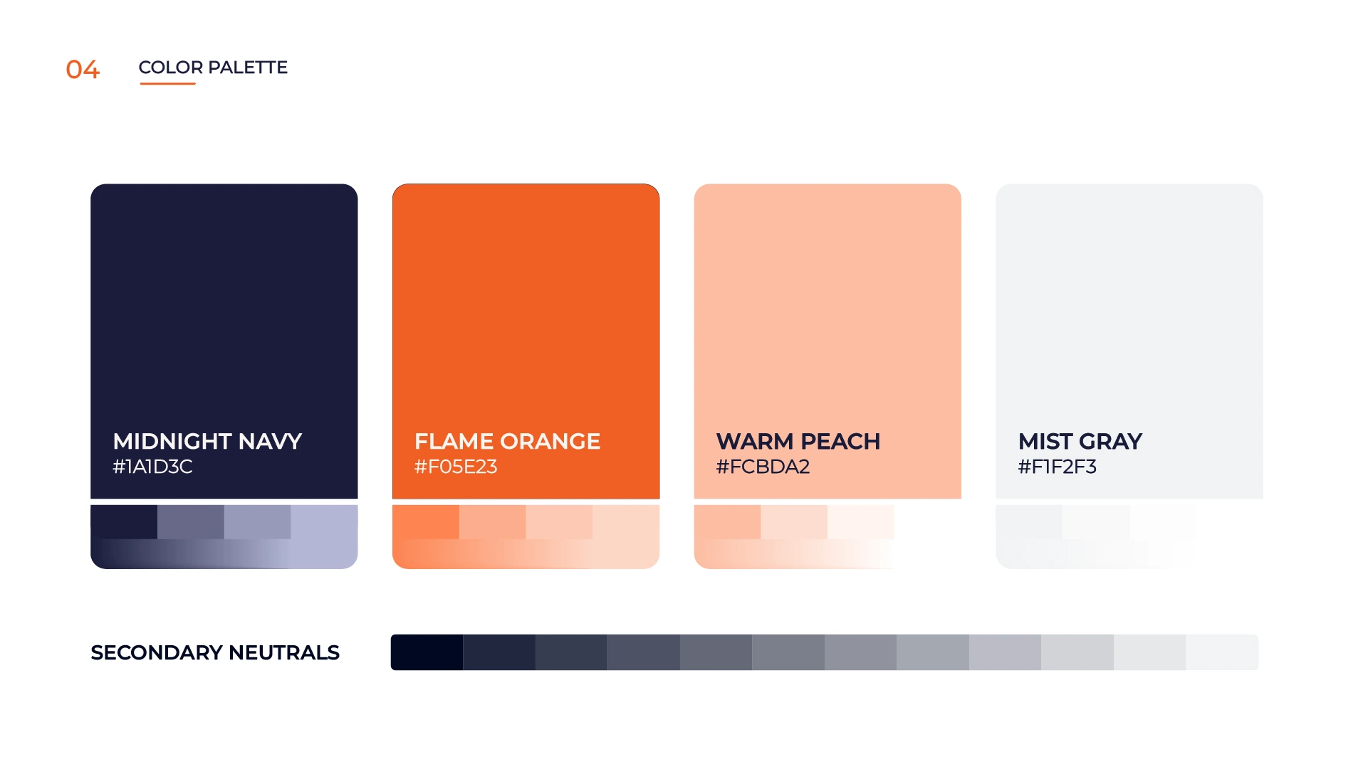
The palette was intentionally kept limited so OneStop Warehouse could build recognition through repetition. Midnight Navy provides authority, reliability and visual weight. Flame Orange introduces energy, movement and a strong brand signature.
Warm Peach extends the orange family for softer supporting graphics. Mist Gray gives information-heavy applications room to breathe.
- Midnight Navy · #1A1D3C
- Flame Orange · #F05E23
- Warm Peach · #FCBDA2
- Mist Gray · #F0F1F3
07 · Typography
Clear. Modern. Highly readable.
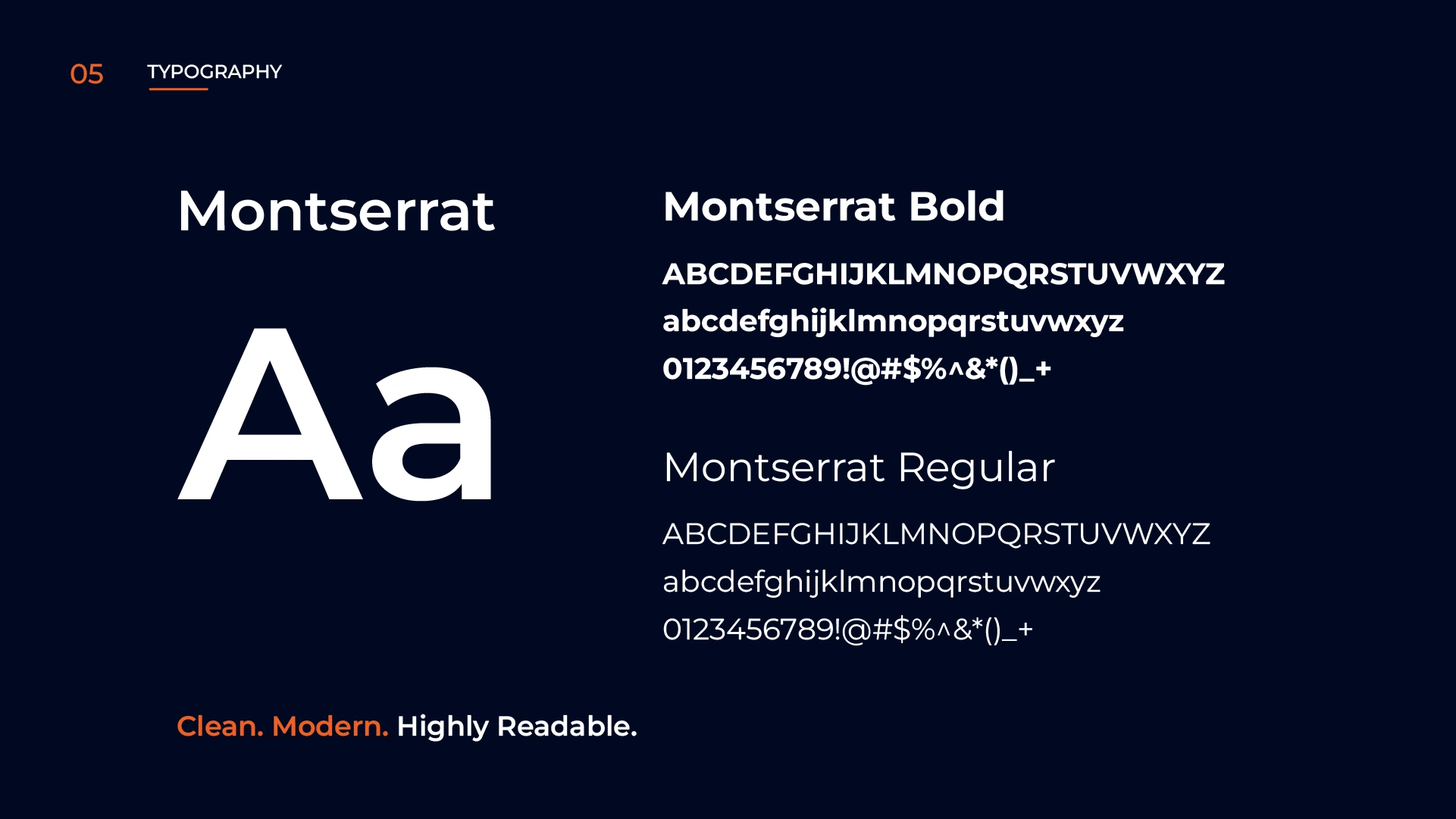
Montserrat was selected as the core typeface because the identity needed to remain readable across everything from social content to formal operational documents. Its geometric structure also complements the circular architecture of the logo.
Montserrat Bold supports headlines, key messaging and calls to action. Montserrat Regular supports body copy, descriptions and functional communication.
08 · Visual language
From logo to complete visual language.
The project was designed beyond the logo from the beginning. Midnight Navy surfaces, Flame Orange highlights, logistics photography, controlled curved forms, line-based service iconography and Montserrat typography create a recognizable system across many services.
Explore Keyreative’s connected brand identity and graphic design capabilities, or see the focused Brand Identity Foundation package.
09 · Usage & application
Built to work across a logistics ecosystem.
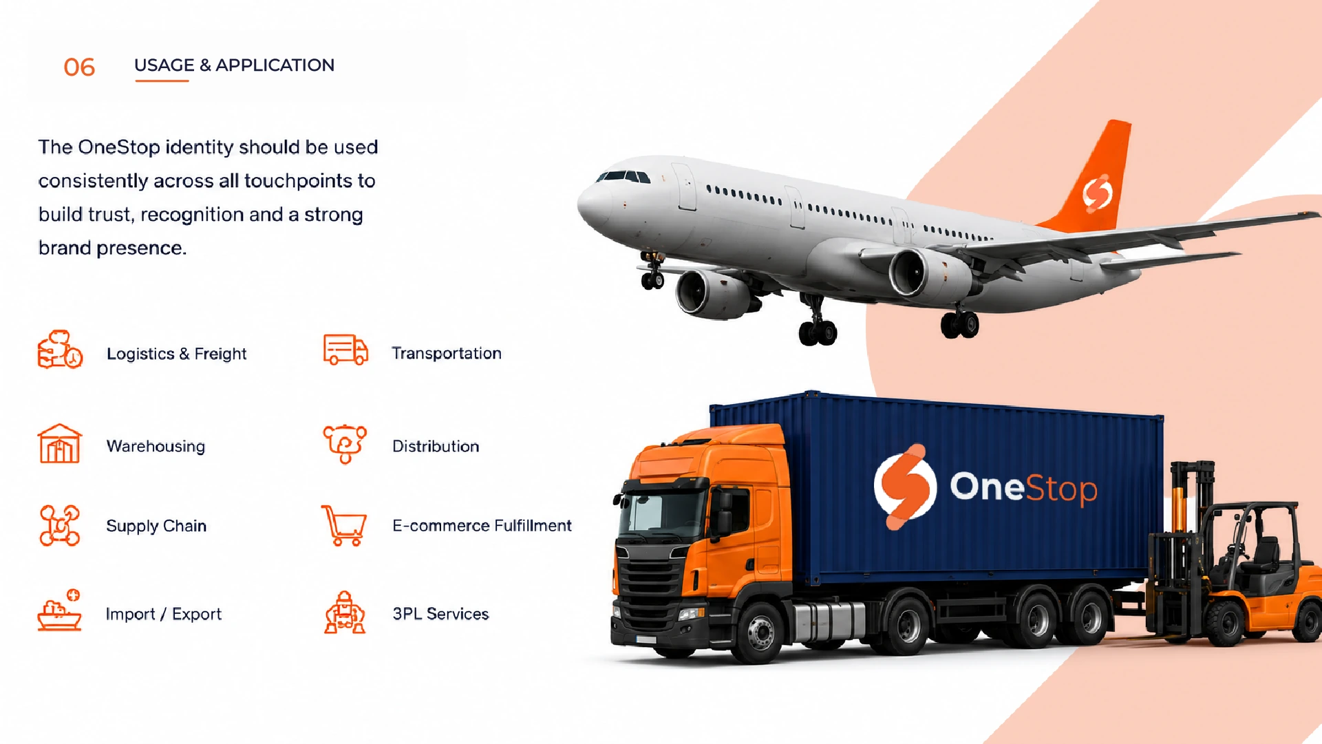
The system was applied to logistics and freight, transportation, warehousing, distribution, supply chain, e-commerce fulfilment, import / export and 3PL services. The broader service offering also includes sourcing, quality control, dropshipping, ocean freight and air freight.
The identity therefore had to work across both physical operations and digital communication.
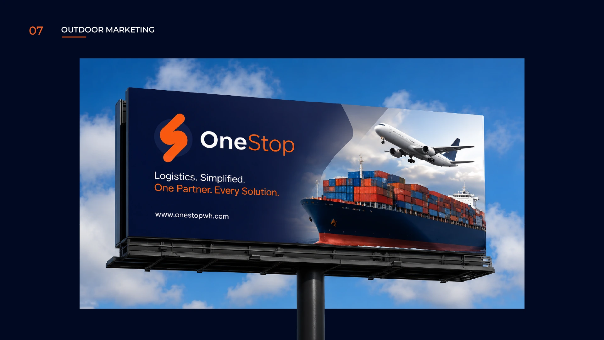
10 · Outdoor marketing
Recognizable at a distance.
Large-format advertising required a simple hierarchy. The billboard system reduces the message to the key positioning: “Logistics. Simplified. One Partner. Every Solution.”
Large freight imagery establishes the industry immediately, while Midnight Navy and Flame Orange provide clear recognition from a distance.
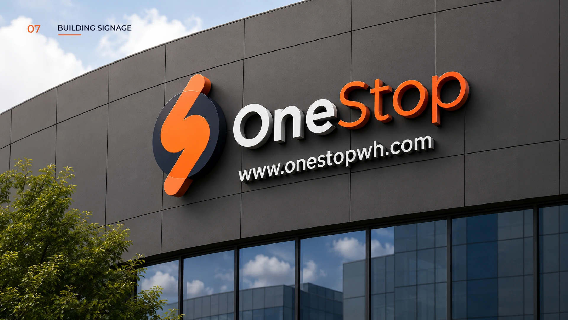
11 · Building signage
Turning the identity into a physical object.
The logo was translated into dimensional architectural signage to test whether the system could move beyond flat graphics. The simple circular base, bold directional form and clean wordmark translate naturally into raised physical signage.
This allows the identity to maintain recognition while gaining depth, materiality and architectural presence.
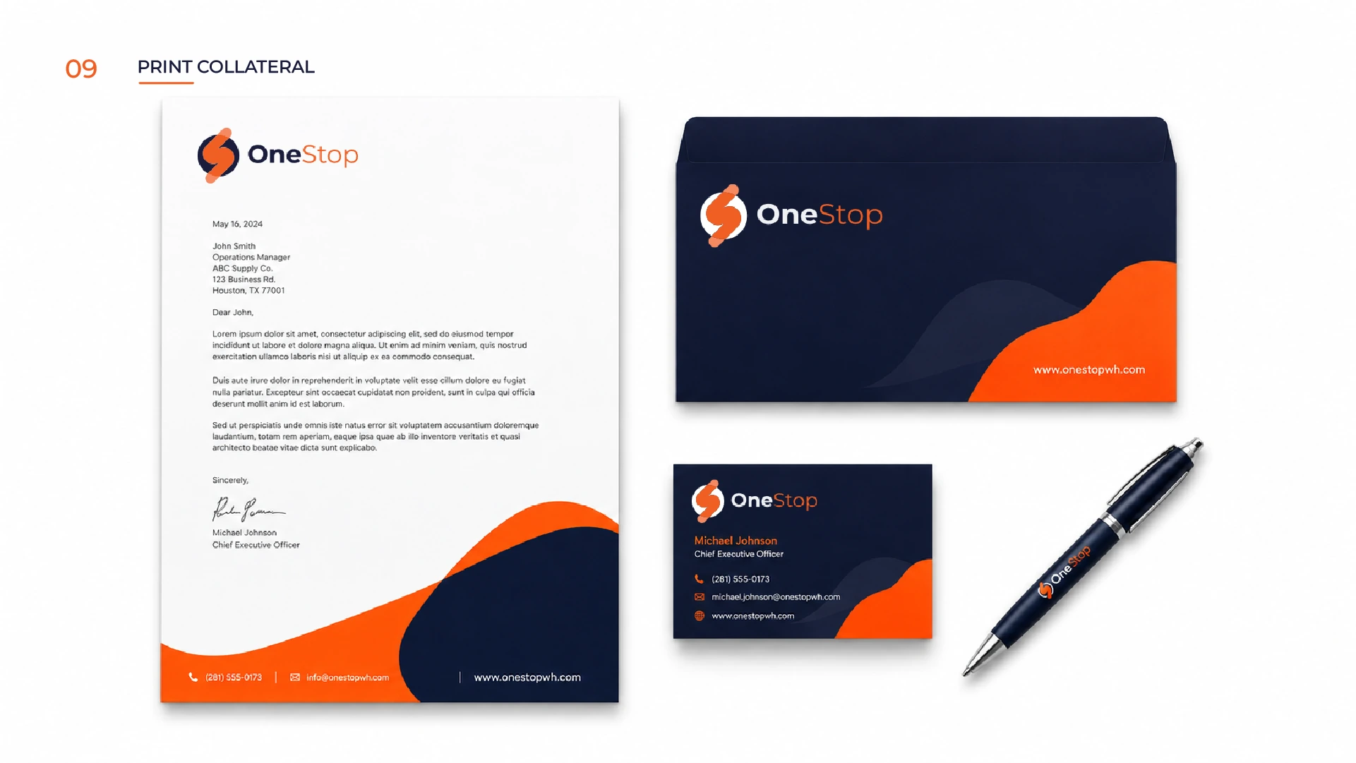
12 · Print collateral
Formal communication without losing the brand.
The print system supports day-to-day business communication without becoming visually heavy. Letterheads remain predominantly white for readability, Midnight Navy and Flame Orange create branded movement, and darker applications give envelopes and business cards compact, high-contrast environments.
- Letterheads
- Envelopes
- Business cards
- Corporate documents
- Branded stationery
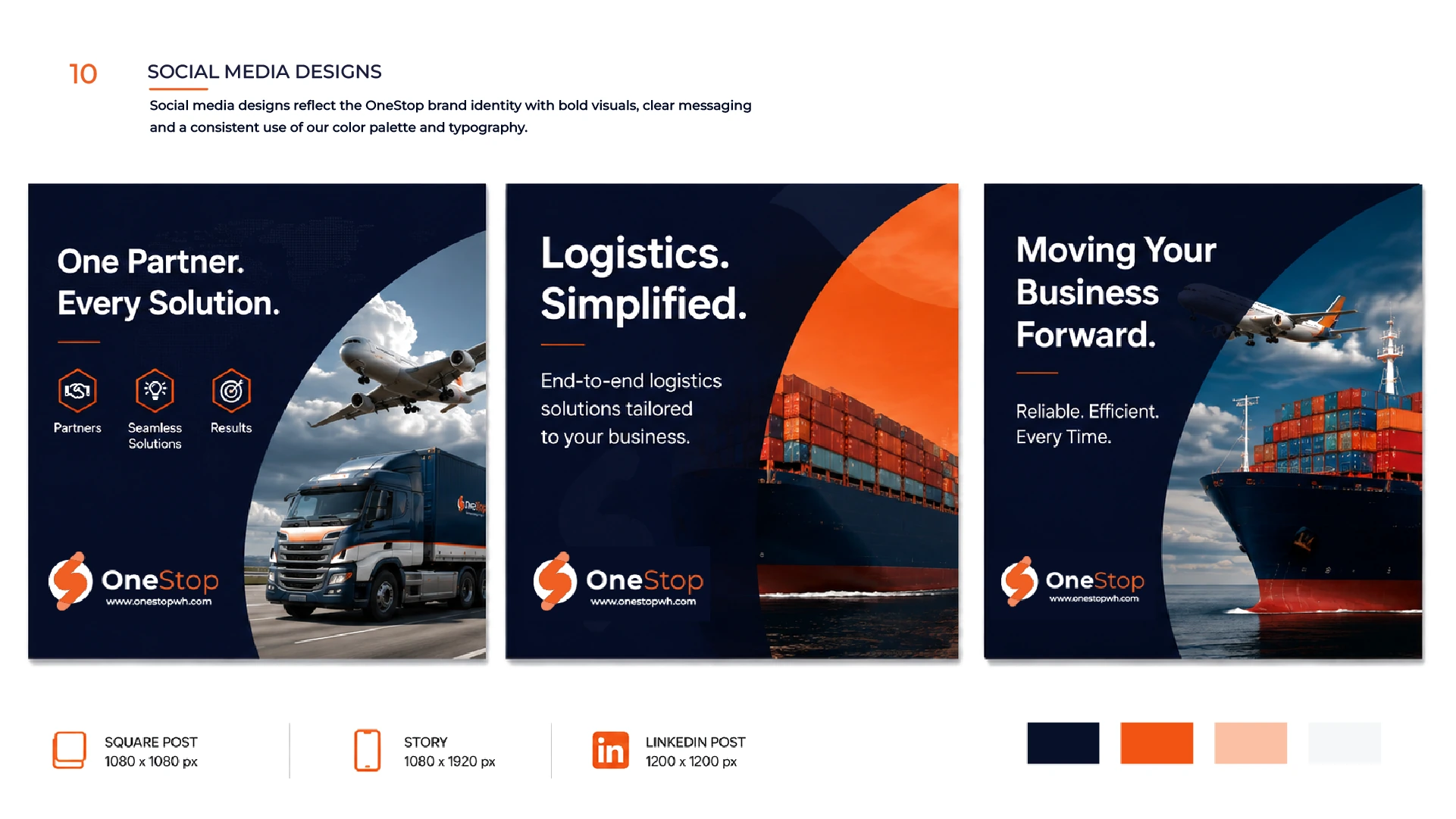
13 · Social media
A repeatable system for ongoing communication.
The social system uses recurring devices instead of isolated templates: a navy foundation, bold Montserrat headlines, orange accents, curved image windows, logistics photography and consistent logo placement.
The framework supports air freight, road transport, ocean freight, warehousing, sourcing and corporate communication while staying visually consistent.
- One Partner. Every Solution.
- Logistics. Simplified.
- Moving Your Business Forward.
14 · Why the system works
Designed to stay consistent as the business scales.
The same logo architecture, colour system, typography and graphic language can move across websites, social media, freight documents, stationery, advertising, warehouse communication, transport applications, containers and signage while continuing to look like the same company.
For a logistics business coordinating multiple parts of an international supply chain, that consistency helps strengthen recognition and trust. Browse more selected work or talk to Keyreative about a connected identity system.
15 · The outcome
One system for many logistics touchpoints.
OneStop Warehouse now has an identity structured around the way the business actually operates. Its China-based logistics operation, 1,500 m² warehouse in Dongguan and broader service offering across sourcing, warehousing, shipping and fulfilment require a system capable of representing much more than one freight service.
The circle represents completeness. The directional S represents movement. Midnight Navy establishes stability. Flame Orange introduces momentum. Together, the system creates one recognizable visual language across physical and digital touchpoints.
One Partner. Every Solution.
Ready to build a connected identity?
Building a brand that needs to work everywhere?
From the first logo concept to signage, digital applications and complete visual systems, Keyreative builds identities designed to stay consistent as businesses grow.
Where to go next
ClientOneStop WarehouseIndustryLogistics, Freight & Supply ChainServicesBrand Identity, Graphic DesignCountryDongguan, ChinaYear2026WebsiteVisit live project
Connected serviceBrand Identity
Connected serviceGraphic Design
Run a logistics, freight & supply chain business? See where your brand or website could work harder.
Request a Free Audit