Castle PhotoArt · Brand Identity
Castle
PhotoArt
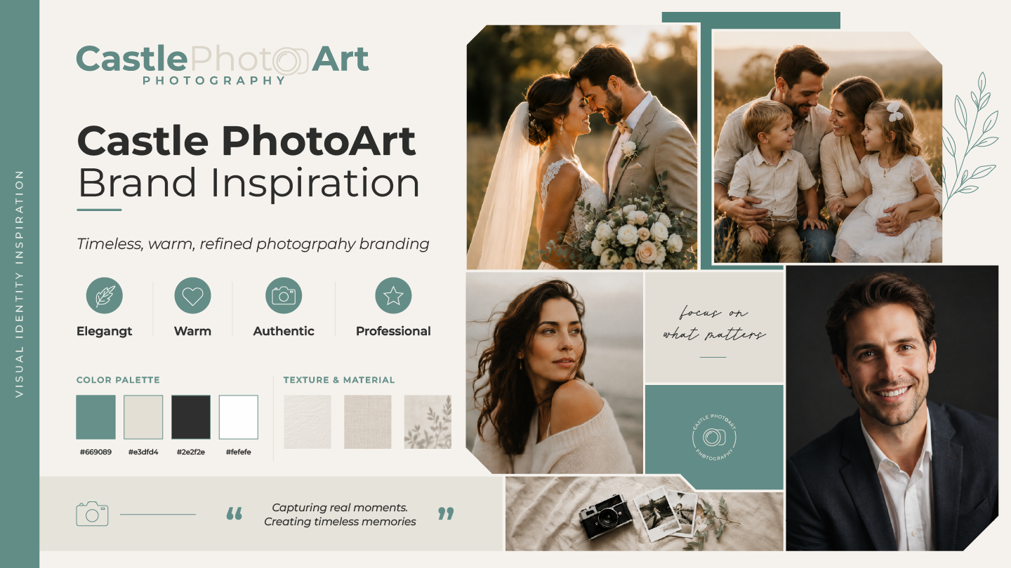
Castle PhotoArt is a photography brand centered on weddings, family portraits, solo shoots and timeless storytelling. It needed an identity that felt warm, refined and emotionally resonant while remaining modern and professional.
The brief
Built for emotion. Designed for trust.
Castle PhotoArt needed a visual identity that could reflect the heart of photography: real people, real moments and lasting memories. The brand had to feel elegant and approachable without becoming overly trendy or corporate. It also needed to work as more than a logo, extending naturally into social media, printed materials, promotional pieces and brand presentation.
The concept
A soft, timeless identity that lets the photography lead.
The concept uses restraint, warmth and clarity to support the photography rather than compete with it. A clean wordmark and subtle lens-inspired detail keep the identity unmistakably photographic, while botanical linework, balanced layouts and soft neutral styling reinforce care, refinement and emotional storytelling.
Color system
Calm warmth with a premium feel.
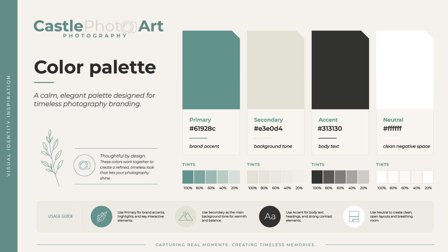
Teal brings calmness and recognition. Warm beige adds comfort and elegance. Deep charcoal creates contrast and readability, while white keeps the system open and versatile. Together they create an elevated but personal visual tone.
A calm palette that frames the story without overpowering it.
Typography
Clean hierarchy for a story-led brand.
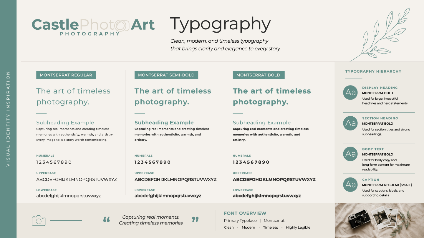
Montserrat was selected for its clarity and modern versatility. Its range of weights moves easily between expressive headlines, supporting information and body copy, keeping brochures, social posts and print collateral structured and easy to read.
Logo usage
Flexible, consistent, and easy to apply.
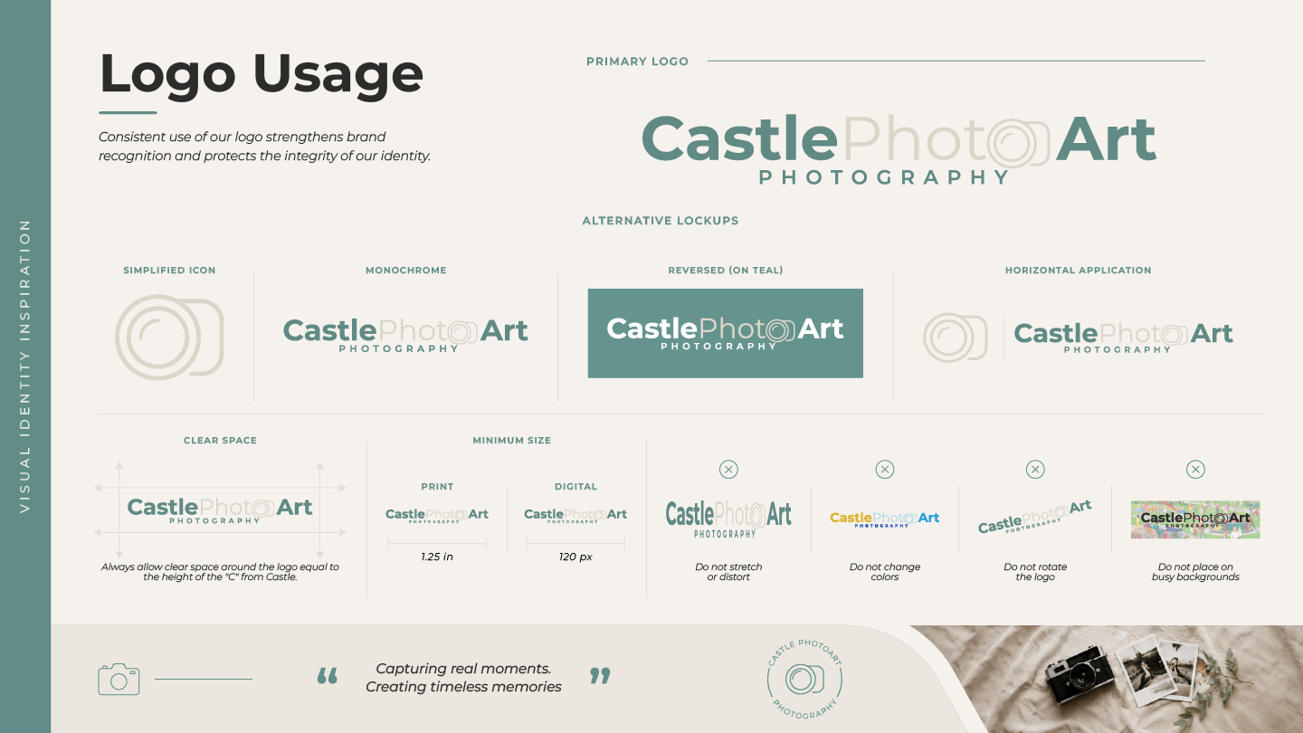
Primary, reversed, horizontal and simplified applications keep the mark recognizable across different sizes and surfaces. Clear spacing, size guidance and usage rules preserve consistency on social posts, thank-you cards, signboards and printed marketing pieces.
The system in motion
From first impression to every touchpoint.
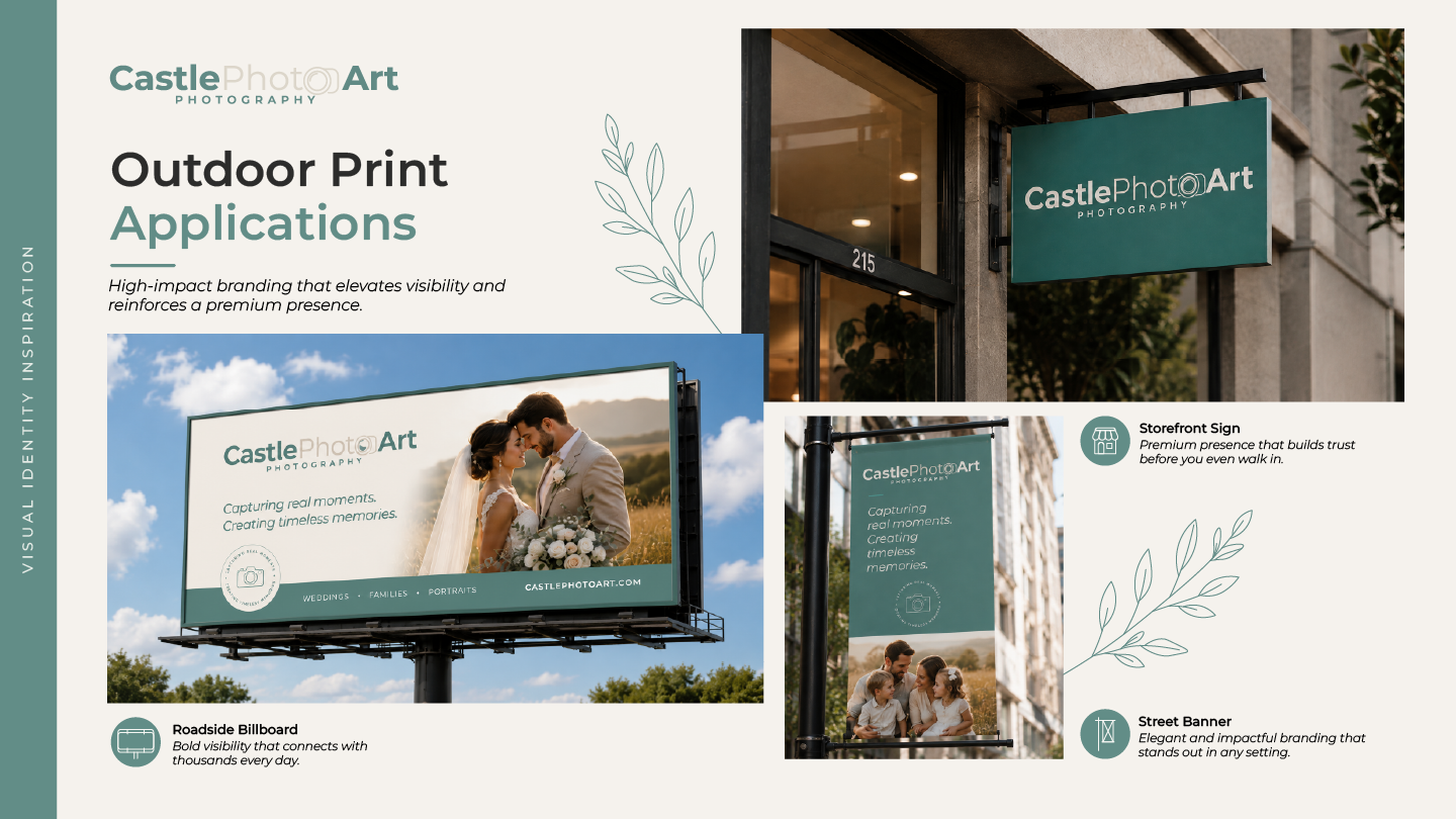
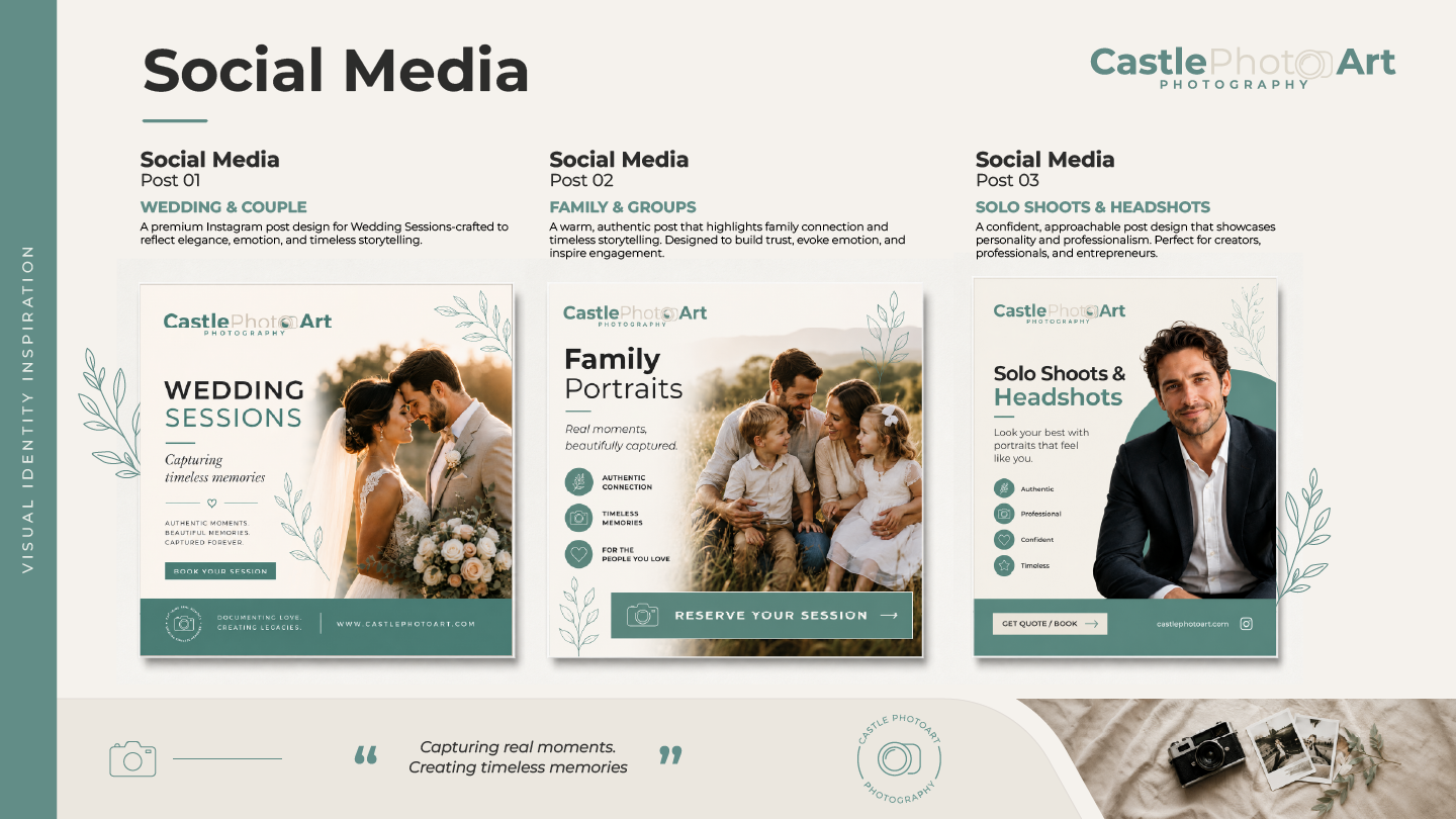
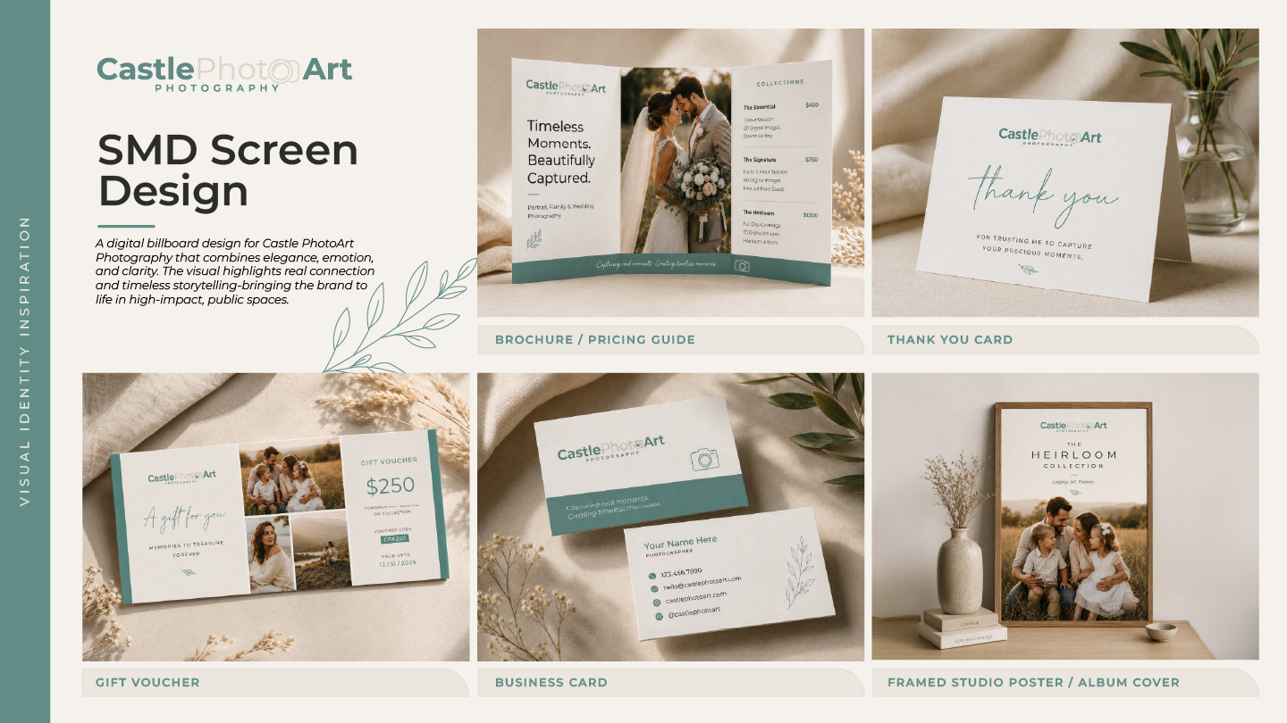
The identity expands across digital and physical applications. Social content supports weddings, families and headshots; outdoor branding holds a premium public presence; and brochures, business cards, thank-you cards, vouchers and framed collateral make the system tactile and personal.
The outcome
A photography brand that feels as timeless as the memories it captures.
Castle PhotoArt now has one cohesive identity spanning logo, color, typography, digital assets and print applications—building trust and a polished foundation for growth.
Where to go next
Run a photography business? See where your brand or website could work harder.
Request a Free Audit